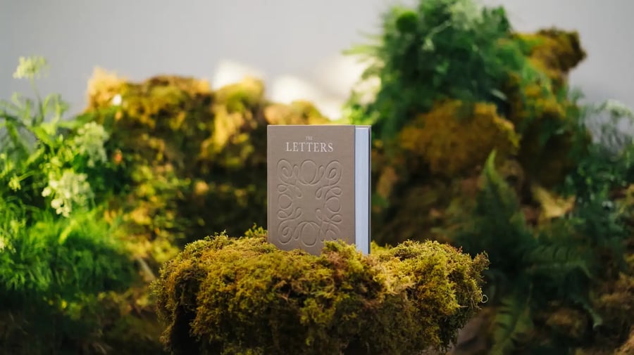
The Alabaster, the Los Angeles-based publisher redefining the way a new generation engages with Scripture and faith, has unveiled a striking new brand identity led by Pentagram, the world’s largest independent design consultancy. The rebrand reflects Alabaster’s evolution over the past decade from a Bible book publisher into a modern lifestyle brand serving a growing spiritual community.
Founded in 2016, Alabaster quickly gained recognition for its beautifully designed Bibles blending art, theology and visual storytelling. Over time, the company expanded into journals, studies and lifestyle tools that support modern faith practice. Now, nearly ten years later, leadership felt it was time for a brand identity that matched its broader mission.
“This rebrand marks a turning point for us: a visual and conceptual transformation that reflects not only who we are, but who we’re becoming,” said Samuel Han, Head of Brand at Alabaster. “We’re evolving to better serve our community through tools and experiences that support spiritual formation in the everyday – whether that’s a morning journal, a study with friends or a quiet moment at home. It’s not just a new look – it’s a new way of showing up.”
The updated design introduces a refined logo system featuring both a wordmark and an icon, along with a new grid-based structure for all future books. The visual language now extends across digital platforms, with updates to printed products set to roll out over the next six to 24 mont
“For Alabaster it's a combination of tradition, with a modern interpretation,” said Pentagram partner Luke Hayman. “We selected a natural palette – nothing too synthetic. The images of nature are obviously an inspiration. For the typography, we wanted a contemporary interpretation of traditional forms. The letterforms for the wordmark – we want elegance, elevated, without being stuffy. And hopefully timeless.”
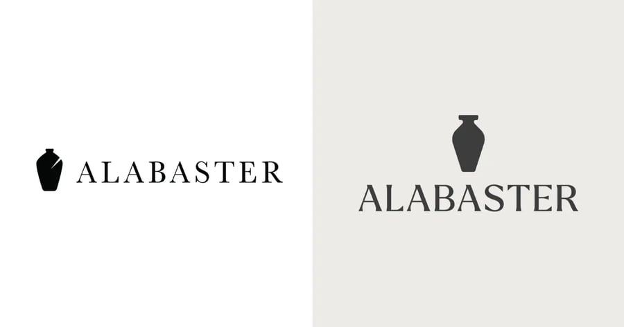
A subtle but powerful addition is the integration of light filigree lines within the new icon. These lines represent both the fragrance flowing from the broken alabaster jar of biblical inspiration and the Holy Spirit filling the room – a visual metaphor that connects deeply with the brand’s name and origin story.
“Alabaster is a much-loved brand and we are careful to not create a jarring experience for existing users. Our goal was for the customers to feel like this update mark is the same but better. It should feel 'right,'” Hayman added.
For Alabaster, this milestone represents more than design; it’s about vision and future purpose. The company’s mission has always drawn from the biblical account of radical devotion symbolized by the breaking of an alabaster jar. With its refreshed identity, the brand is now positioned to expand into new products and experiences that bring faith into the fabric of daily life.
“This moment isn’t just about a new visual identity – it’s about what comes after the breaking of the jar,” Han reflected. “The perfume is now pouring out, filling the space around us. That’s our hope for Alabaster moving forward – that what we create continues to overflow into people’s lives with beauty, meaning and spiritual depth.”
Learn more about Alabaster and experience its design-forward approach to faith-based productshere.
Copyright © 2025 California Business Journal. All Rights Reserved.
For California Business Journal Disclaimers, go to /terms-conditions/.


